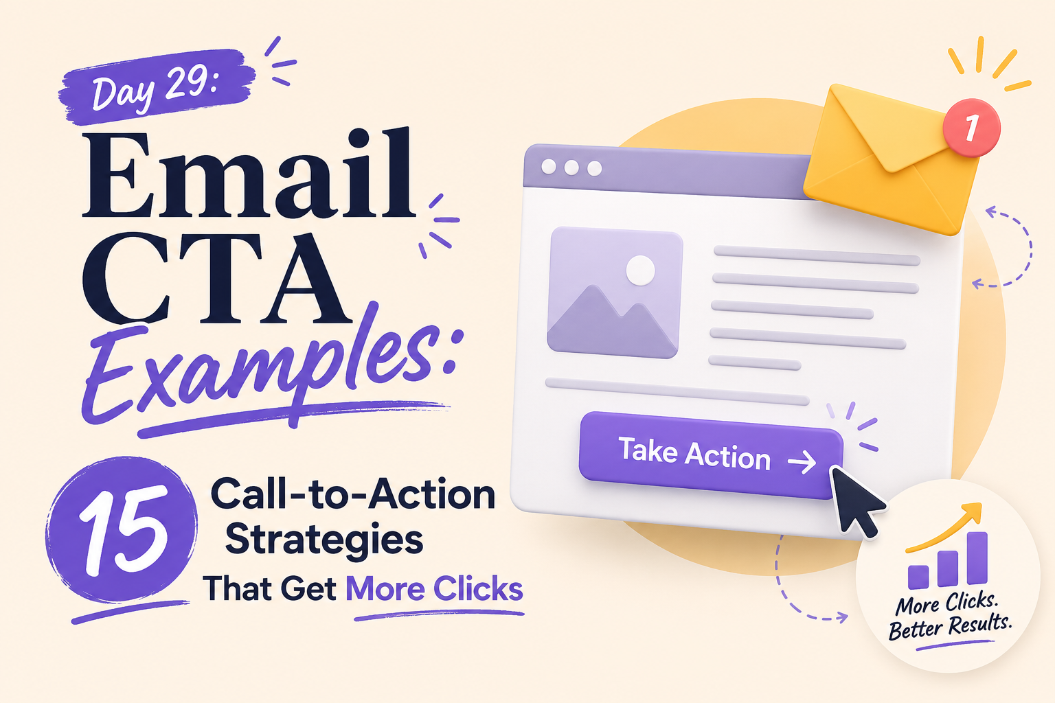





Did you know that nearly 70% of subscribers decide whether to open a message based solely on the subject line, yet the actual conversion happens only when they click your link? Many marketers treat buttons as simple design elements, but they are actually the bridge between reader intent and your business goals.
This guide explores 15 proven tactics to boost your performance. We move beyond basic buttons to show you how to align your messaging with user needs. You will learn how to optimize your strategy for product discovery, promotions, and educational content.
We also cover effective retention methods and customer engagement techniques. Whether you are refining your primary buttons or testing new email signature cta examples, these insights will help you drive meaningful results. By focusing on clear next steps, you transform passive readers into active participants.
Key Takeaways
- Understand how to align subscriber intent with clear, actionable buttons.
- Learn 15 distinct strategies to improve your click-through rates.
- Discover how to apply these tactics to product discovery and promotions.
- Master the art of using educational content to drive engagement.
- Implement professional signature links to maximize every touchpoint.
Turn More Readers Into Clickers
Ready to turn more readers into active customers? Use these proven email CTA strategies to create clearer buttons, stronger offers, and more clicks from every campaign.
What Makes an Email CTA Worth Clicking
Understanding why subscribers click is the secret to mastering email CTA best practices. A successful button does not just stand out visually; it provides a logical next step that feels rewarding to the reader. When you align your design with user psychology, you transform passive readers into active participants. Looking at practical email CTA examples can help marketers understand how small changes in wording and placement influence engagement.
Match the CTA to the subscriber’s immediate goal
Your audience opens your email with a specific intent, whether they are looking for information, a discount, or a solution to a problem. If your call-to-action does not mirror that intent, the connection breaks. You must ensure that your button text speaks directly to what the user wants to achieve in that exact moment. The best email CTA examples make that desired outcome immediately clear.
Consider these factors when aligning your goals:
- User Intent: Are they in the research phase or ready to buy?
- Context: Does the email content provide enough value to justify the click?
- Relevance: Is the destination page a direct match for the promise made in the email?
Connect the button copy to the email’s promise
Consistency is the foundation of trust in digital marketing. If your subject line or body copy promises a specific benefit, your button must reinforce that exact value. Effective email CTA examples often use action-oriented language that echoes the main message of the email body.
When the button copy feels like a natural conclusion to the email’s narrative, the user feels more confident clicking. Avoid generic phrases like “Click Here,” which offer no context. Instead, use descriptive language that tells the subscriber exactly what they will gain by interacting with your brand. Reviewing strong email CTA examples can help you identify language that communicates value without adding unnecessary friction.
Use one primary action instead of competing requests
One of the most common mistakes in email design is providing too many choices. When you present multiple buttons or links, you force the reader to make a decision, which often leads to them taking no action at all. By focusing on one primary goal, you reduce cognitive load and increase your conversion rates. Many effective email CTA examples follow this focused approach by giving subscribers one obvious next step.
If you have secondary information to share, place it further down in the email or use a text link that does not distract from the main CTA. Keeping your layout clean ensures that your primary message remains the star of the show. Reviewing successful email CTA examples will show you that simplicity is almost always the key to driving higher engagement.
Email CTA Examples: The Anatomy of High-Converting Button Copy
Your email button is the final bridge between a subscriber’s interest and a completed action. When you design your campaigns, the language you choose determines whether a user clicks or moves on. Mastering these email CTA examples requires a focus on clarity, intent, and direct communication.
Lead with specific action verbs
Effective buttons start with a strong verb that tells the reader exactly what to expect. Words like “Get,” “Shop,” “Read,” “Download,” and “Watch” remove ambiguity from the user experience. By using these verbs, you provide a clear instruction that reduces the mental effort required to engage with your content. This pattern appears consistently across high-performing email CTA examples.
Communicate the value behind the click
A great button does more than command; it promises a specific benefit. Instead of focusing on the technical action, highlight what the user gains by clicking. When you align your copy with the subscriber’s immediate needs, you increase the likelihood of a successful conversion. Effective email CTA examples put that subscriber benefit ahead of the mechanics of clicking.
Create urgency without using misleading pressure
Urgency is a powerful tool, but it must remain grounded in reality to maintain trust. Use time-sensitive language that reflects actual deadlines rather than creating fake scarcity. This approach ensures your email cta best practices remain ethical while still driving immediate engagement.
Examples of clear, benefit-focused CTA language
Clear language transforms a generic button into a compelling invitation. For instance, replacing “Submit” with “Get My Free Guide” immediately tells the user what they will receive. This shift in perspective is a cornerstone of professional email marketing. It is also one of the easiest principles to spot when comparing different email CTA examples.
Words that make email CTAs vague or easy to ignore
Some words lack the punch needed to drive action. Terms like “Click Here,” “Submit,” or “Enter” are often ignored because they fail to describe the value of the interaction. Avoiding these passive phrases is essential for any marketer looking to improve their results.
| Vague Phrasing | Strong Alternative | Primary Benefit |
|---|---|---|
| Click Here | Get Your Discount | Financial Savings |
| Submit | Download My Report | Educational Value |
| Read More | See the Full Guide | Comprehensive Insight |
| Join Now | Start Your Free Trial | Risk-Free Access |
By implementing these email cta best practices, you can refine your messaging to be more persuasive. Consistently testing your button copy will help you understand what resonates most with your specific audience. Comparing different email CTA examples during testing can reveal which wording generates stronger engagement.
CTA Strategies for Product Discovery Emails
When you want to guide subscribers toward new items, your choice of call-to-action language dictates the entire shopping experience. The strongest email CTA examples for ecommerce make the discovery process feel simple and intentional.
By aligning your button text with the specific intent of your audience, you can significantly improve your click-through rates. These cta email examples demonstrate how to tailor your messaging to different stages of the customer journey.
Invite subscribers to browse with “Shop the New Collection”
Why the CTA works for product launches
This direct approach creates a sense of urgency and excitement surrounding a fresh release. It signals to the reader that they are among the first to see your latest inventory. Using this phrase is highly effective when you have a clear, time-sensitive reason for the subscriber to visit your site immediately.
How to support the button with product-focused email copy
To make this button effective, surround it with high-quality imagery that highlights the hero product of the collection. Use descriptive, benefit-driven text that explains why these new items are essential. When the copy builds anticipation, the button becomes a natural next step for the reader.
Use “See What’s New” to reduce commitment for curious shoppers
When a softer discovery CTA is the better choice
Sometimes, a high-pressure sales approach can alienate subscribers who are just browsing. A softer CTA like “See What’s New” invites exploration without the immediate pressure to purchase. This is ideal for weekly newsletters or general brand updates where you want to maintain a friendly, low-friction relationship.
How to pair discovery language with an engaging preview
Pair this language with a carousel or a grid of diverse products to show the breadth of your catalog. By providing a small preview of different categories, you allow the subscriber to self-select what interests them most. This strategy turns your email CTA examples into a personalized discovery tool rather than a hard sales pitch.
Turn recommendations into action with “Find Your Perfect Match”
How guided CTAs help subscribers choose confidently
Guided CTAs are powerful because they promise a solution to a specific problem. When you use “Find Your Perfect Match,” you shift the focus from the product to the user’s needs. This builds trust and helps the subscriber feel that your brand understands their unique preferences.
Product categories that benefit from recommendation-driven copy
This approach works exceptionally well for complex categories like skincare, footwear, or home decor. If your products require a decision based on skin type, size, or style, a guided CTA helps the user navigate the complexity. By linking this button to a quiz or a curated landing page, you provide a seamless path to conversion. This is another reason personalized email CTA examples can be more effective than generic button copy.
CTA Strategies for Sales and Promotional Emails
Driving conversions in promotional campaigns relies on clear, benefit-driven language that removes friction. The best email CTA examples in promotional campaigns make the offer immediately understandable. When you design your messages, the button must act as a bridge between the subscriber’s interest and the final purchase. Using effective cta email examples helps ensure your audience understands exactly what they gain by clicking.
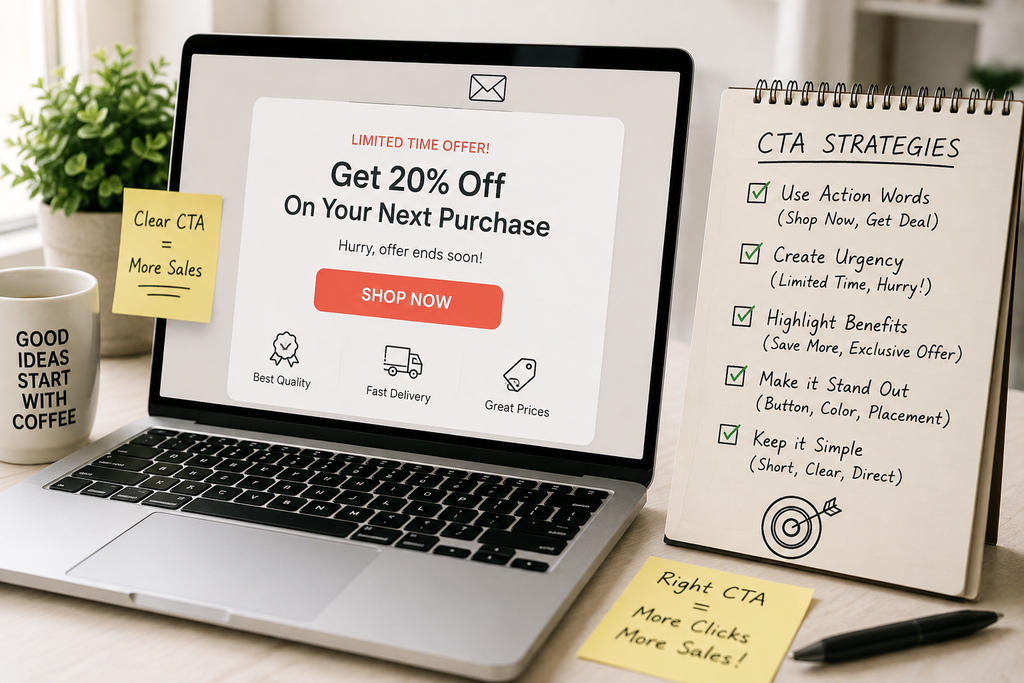
Make the offer direct with “Get 20% Off Today”
How to make discount CTAs clear and credible
Clarity is the foundation of trust in digital marketing. When you promise a discount, the button copy should reflect that value immediately. Strong email CTA examples accomplish this by putting the reward directly into the action. Avoid vague phrases like “Click Here” and instead use specific language that highlights the reward.
Where to place the offer details near the button
Place your terms and conditions in close proximity to the button to maintain transparency. By keeping the fine print visible, you prevent confusion and build confidence. This approach is a hallmark of successful email call to actioon examples that convert.
Use “Claim Your Free Shipping” to emphasize a concrete benefit
Why removing a purchase obstacle can improve clicks
Shipping costs often serve as the primary reason for cart abandonment. By highlighting free shipping in your call-to-action, you remove a major barrier to entry. This strategy works because it focuses on the total cost rather than just the item price. Benefit-focused email CTA examples can make these savings easier for subscribers to recognize.
How to define eligibility and expiration dates clearly
Always include necessary qualifiers to keep your messaging honest. If the offer only applies to orders over a certain amount, state that clearly. Use a small, readable font directly below the button to list:
- Minimum purchase requirements
- Geographic restrictions
- Specific expiration dates
Build urgency with “Shop Before the Sale Ends”
How to use time-sensitive CTA copy responsibly
Urgency is a powerful tool, but it must be used with integrity. When you use phrases like “Shop Before the Sale Ends,” ensure the deadline is real and clearly communicated. Misleading your subscribers with fake countdowns will damage your brand reputation over time.
When urgency supports the offer instead of distracting from it
Effective urgency creates a helpful nudge rather than a sense of panic. Use it to remind customers of a closing window of opportunity for a genuine deal. When your email call to actioon examples align with actual event timelines, you encourage decisive action without compromising your professional standards.
CTA Strategies for Content and Educational Emails
Educational emails serve as a bridge between your brand and your audience’s desire for knowledge. When you provide high-quality content, your call-to-action (CTA) must clearly signal what the reader will gain by clicking. Following email cta best practices ensures that your subscribers feel confident about the value waiting on the other side of the link. Studying relevant email CTA examples can make these principles easier to apply to educational campaigns.
Make Every CTA Count
Stop losing clicks to vague buttons. Discover practical CTA examples that match subscriber intent, communicate value clearly, and make every email easier to act on.
Encourage low-friction reading with “Read the Full Guide”
Using a clear, descriptive CTA like “Read the Full Guide” removes the guesswork for your subscribers. It tells them exactly what to expect, which is a cornerstone of effective email marketing.
How to set expectations about the linked content
You should always clarify the format of the destination page. If you are linking to a long-form article, mention the estimated reading time or the depth of the topic. This transparency builds trust and prepares the reader for the experience. Many effective email CTA examples use this same approach to set expectations before the click.
Why specificity improves clicks on editorial emails
Vague buttons like “Click Here” often fail because they lack context. Specificity acts as a promise, telling the user that the content is worth their time. This makes specific email CTA examples particularly useful for newsletters, guides, and educational resources. When your button copy matches the editorial tone of your email, you see higher engagement rates.
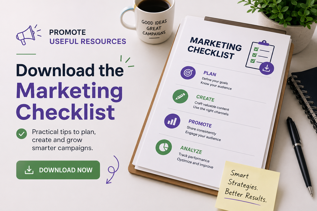
Promote useful resources with “Download the Marketing Checklist”
When you offer a downloadable asset, your CTA needs to highlight the immediate utility of the file. A phrase like “Download the Marketing Checklist” focuses on the tangible benefit the user receives.
How to highlight the resource’s practical value
Focus on the problem your resource solves rather than just the file type. Use action-oriented language that emphasizes how the checklist or template will make the user’s life easier or their work more efficient.
What to include on the landing page after the click
Continuity is vital for conversion. Ensure the landing page headline matches the promise made in your email. Provide a clear, simple form or download button so the user can access the resource without unnecessary friction.
Drive deeper engagement with “Watch the Five-Minute Tutorial”
Video content is highly effective for complex topics, but users need to know the time commitment involved. A CTA that specifies the duration, such as “Watch the Five-Minute Tutorial,” helps users decide if they have the time to engage right now.
How format-specific language builds confidence
By labeling your content as a video, you set clear expectations for the medium. This prevents frustration for users who might be in a setting where they cannot listen to audio. It also helps you stand out in a crowded inbox, similar to how professional email signature cta examples provide a consistent brand touchpoint.
How to make video CTAs accessible and informative
Always include a brief description of what the video covers near the button. This ensures that even if a user cannot watch immediately, they understand the value of the content. Consider the following comparison of CTA strategies for different content types:
| Content Type | CTA Strategy | Primary Benefit |
|---|---|---|
| Long-form Guides | Read the Full Guide | Sets clear time expectations |
| Downloadable Assets | Download the Checklist | Highlights immediate utility |
| Video Tutorials | Watch the 5-Min Video | Reduces commitment anxiety |
Improve Your Next Email
Your next email can perform better with one focused action. Apply these CTA strategies to reduce friction, build trust, and turn attention into measurable engagement.
CTA Strategies for Retention and Customer Engagement
Building long-term loyalty requires a shift in how you approach your messaging. Retention emails should focus on the ongoing relationship you share with your subscribers. Use these email call to actioon examples to guide customers toward their next logical step, such as joining a rewards program or updating their profile preferences.
Effective communication relies on consistency. Your button copy must mirror the promise made in your email body to ensure a smooth transition to your landing page. Brands like Patagonia and Sephora excel at this by keeping their messaging clear and benefit-driven. When your call to action matches the subscriber’s current stage in the journey, engagement rates naturally climb.
Test different phrases to see what resonates with your specific audience. Small adjustments to your button text can lead to significant improvements in click-through rates. Testing multiple email CTA examples gives you a practical way to discover which messages resonate with your audience.
Review these email CTA examples to identify patterns that drive repeat visits and deeper brand interaction. Your goal is to make every interaction feel personal, valuable, and easy to complete. The most effective email CTA examples support that goal by making the next action obvious and relevant.
Start refining your strategy today by auditing your current automated flows. Look for opportunities to simplify your requests and highlight the immediate value for the user. Consistent testing remains the best way to optimize your results over time. Apply these principles to your next campaign and watch your customer engagement grow.
FAQs
What are the foundational email cta best practices for increasing click-through rates?
To maximize your engagement, you should ensure every call to action aligns with the subscriber’s immediate goal and reinforces the email’s central promise. Professional strategies involve using one primary action to avoid choice paralysis, leading with specific action verbs, and creating a sense of urgency that feels credible rather than misleading.
Can you provide email cta examples that work well for product discovery?
High-performing brands like Nike and Sephora often use “Shop the New Collection” to drive interest in recent launches. For shoppers who aren’t ready to commit, softer discovery language like “See What’s New” reduces pressure, while guided options like “Find Your Perfect Match” help customers navigate personalized recommendations with confidence.
What are some effective email call to actioon examples for promotional sales?
For sales, clarity is your best tool. Use direct, benefit-focused phrases such as “Get 20% Off Today” or “Claim Your Free Shipping” to make the value proposition unmistakable. To drive immediate results, urgency-driven copy like “Shop Before the Sale Ends” encourages subscribers to act before an offer expires, provided the deadline is clearly stated.
How do cta email examples for educational content differ from promotional ones?
Content-focused CTAs should focus on setting accurate expectations for the destination. Instead of generic “Click Here” buttons, use format-specific language such as “Read the Full Guide,” “Download the Marketing Checklist,” or “Watch the Five-Minute Tutorial.” This transparency helps your audience understand exactly what they will receive, which builds trust and increases the likelihood of a click.
What are some professional email signature cta examples to drive passive engagement?
Your email signature is a powerful tool for ongoing engagement. You can include links such as “Book a Demo on Calendly,” “View Our Latest Case Study,” or “Register for Our Upcoming Webinar.” These examples allow you to promote high-value resources or meetings in every one-on-one interaction without being overly aggressive.
Why should I avoid vague wording in my email buttons?
Vague words like “Submit,” “Learn More,” or “Click Here” often fail because they don’t communicate the specific value behind the action. By replacing them with benefit-driven verbs like “Get,” “Save,” or “Start,” you make the intended outcome easier to understand. Professional copywriting focuses on what the user gains, rather than the mechanical task of clicking a button.