
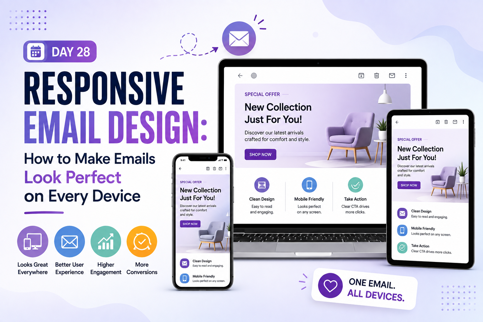





Have you ever opened a message on your phone only to find the text microscopic and the layout completely broken? In today’s mobile-first world, your audience expects a seamless experience regardless of the hardware they use. This is where responsive email design becomes essential for your brand’s success.
This approach involves creating messages that automatically adapt to phones, tablets, and desktop screens. By utilizing fluid widths, scalable images, and readable typography, you ensure your content remains accessible everywhere. These responsive email design techniques preserve usability even when screen space changes drastically.
In this guide, we will walk you through the practical steps to master this craft. You will learn how to plan your layout, structure your HTML, and optimize images for faster loading. We also cover accessibility, client testing, and troubleshooting to help you boost your conversion rates effectively.
Key Takeaways
- Understand how fluid layouts adapt to various screen sizes.
- Learn the importance of touch-friendly buttons for mobile users.
- Discover how to optimize images to maintain visual quality without slowing load times.
- Explore best practices for readable typography across all devices.
- Gain insights into testing your messages across different platforms to ensure consistency.
Turn Better Email Design Into Better Results
Create responsive emails that look polished everywhere, improve readability, and guide more subscribers toward action. Start your free trial today and experience smarter email creation.
What Is Responsive Email Design?
If you have ever wondered why some emails look perfect on your phone while others require constant zooming, you are looking for the answer to what is responsive email design. At its core, this approach uses flexible layouts that automatically adjust to the screen size of the device being used. By utilizing fluid containers and percentage-based widths, your content remains readable and visually appealing on everything from a small smartphone to a large desktop monitor.
How Responsive Email Design Adapts to Screen Size
The magic behind this responsive email design flexibility lies in CSS media queries. These snippets of code act as instructions for the email, telling it to change its layout when it detects a specific screen width. For example, a multi-column layout on a desktop might stack into a single, easy-to-read column when viewed on a mobile device.
This ensures that your text remains large enough to read without pinching and zooming. Furthermore, images scale proportionally to prevent them from breaking the layout or pushing content off the screen. This level of adaptability is essential for maintaining a professional brand image in today’s mobile-centric world.
Why Mobile-First Email Design Matters
Mobile-first responsive email design planning is a strategy that prioritizes the smallest screen experience before adding complexity for larger displays. By focusing on limited screen real estate, responsive email design forces you to identify your most important content and calls to action immediately. This discipline results in cleaner, more effective emails that respect the user’s time and attention.
When you design for mobile first, responsive email design naturally optimizes for touch interactions, such as ensuring buttons are large enough to tap with a thumb. Once the mobile experience is solid, you can then enhance the layout for tablets and desktops. This approach guarantees that your primary message is never lost, regardless of the device.
Responsive Design Email Templates Versus Fixed-Width Emails
Choosing between responsive design email templates and older, fixed-width layouts is a critical decision for your marketing strategy. Fixed-width emails are built with static pixel dimensions, which often cause them to appear tiny on mobile screens. Users are frequently forced to scroll horizontally or zoom in just to read your message, which leads to high bounce rates.
In contrast, responsive email design provides a fluid experience that scales gracefully. The following table highlights the key differences between these two approaches to help you understand why modern standards favor flexibility.
| Feature | Fixed-Width Layout | Responsive Layout |
|---|---|---|
| Screen Adaptation | None (Static) | Automatic (Fluid) |
| User Experience | Requires zooming/scrolling | Optimized for all devices |
| Mobile Performance | Poor | Excellent |
| Development Effort | Low | Moderate |
Plan Your Responsive Email Layout Before Coding
Successful email campaigns using responsive email design begin with a clear blueprint rather than immediate coding. By establishing a solid foundation, you ensure that your message remains consistent across every device. Learning how to design a responsive email starts with understanding your specific objectives and how they translate to different screen sizes.
Define the Email’s Primary Goal and Call to Action
Every email should have one clear purpose. Whether you want to drive sales, share news, or invite users to an event, your primary call to action (CTA) must be the focal point. When you define this goal early, you can build the rest of your content around it to minimize distractions.
A focused approach helps you prioritize what matters most to your subscribers. By limiting the number of competing links, you increase the likelihood that readers will take the desired action. This clarity is essential for maintaining high engagement rates.
Map Content Priorities for Mobile and Desktop Readers
Your content hierarchy should adapt to the device being used. Desktop users often enjoy a rich, visual experience, while mobile users prefer quick, scannable information. You must decide which elements are essential for every reader and which can be simplified or hidden on smaller screens.
Consider the reading order of your content. On a desktop, you might place secondary information in a sidebar, but this often fails on mobile devices. Mapping out these priorities ensures that your responsive email layout remains effective regardless of the viewport.
Choose a Single-Column or Multi-Column Responsive Email Layout
Selecting the right structure is a vital part of the responsive email design process. A single-column layout is often the safest choice for responsive email design mobile-first strategies, while multi-column designs offer more flexibility for desktop displays. The following table highlights the best use cases for each approach.
| Layout Type | Best For | Mobile Experience | Desktop Experience |
|---|---|---|---|
| Single-Column | Newsletters, Announcements | Excellent readability | Clean and focused |
| Multi-Column | Product Grids, Features | Stacks vertically | High information density |
| Hybrid | Complex Marketing | Adaptive stacking | Dynamic and versatile |
When to Use a Single-Column Layout
You should use a single-column layout when you want to maximize readability and minimize user effort. This format is ideal for long-form content or emails with a single, powerful message. It naturally guides the reader’s eye from top to bottom, which is perfect for mobile devices.
How to Stack Multiple Columns on Small Screens
If you choose a multi-column design, you must plan for how those columns will behave on mobile. The standard practice is to stack columns vertically so that the content remains readable without requiring horizontal scrolling. This ensures that your responsive email layout maintains a logical flow, allowing users to consume your content in the intended order.
Build a Flexible Email Structure With Reliable HTML
Building a reliable email architecture is the foundation of any successful responsive email design strategy. Because major email clients often interpret modern web standards inconsistently, you must rely on proven structural techniques to ensure your message reaches the inbox exactly as intended.
Use Table-Based Layouts for Broad Email Client Support
While modern web development has moved toward flexbox and grid systems, responsive email design development remains rooted in table-based layouts. Tables provide the most consistent rendering across legacy clients like Outlook, which often ignore newer CSS properties.
By nesting tables, you create a rigid responsive email design framework that prevents your content from collapsing or shifting unexpectedly. This approach ensures that your responsive email layout remains stable regardless of the recipient’s chosen email provider.
Set a Fluid Container With a Safe Maximum Width
To achieve a professional responsive email design look, you should wrap your content in a fluid container. This container allows your email to expand gracefully on large desktop monitors while remaining constrained on smaller mobile screens.
Setting a maximum width—typically between 600 and 650 pixels—prevents your text from stretching too far, which can hurt readability. This balance ensures that your design feels intentional and polished on every device.
Apply Inline CSS for Critical Styling
Many email clients strip out styles defined in the head of your document or external stylesheets. To guarantee your design renders correctly, you must apply your critical styling directly inline within your HTML tags.
Focus on essential properties like font families, colors, and padding. By keeping these styles close to the content, you minimize the risk of your email appearing unstyled or broken in restrictive environments.
Use Media Queries to Adjust Mobile Styles
Media queries allow you to change your layout dynamically based on the width of the user’s screen. You can use these to stack columns, increase font sizes, or hide non-essential elements when the email is viewed on a smartphone.
Target Common Breakpoints Without Overcomplicating the Code
You do not need to create a unique breakpoint for every possible device size. Instead, focus on a few standard widths, such as 480 pixels or 600 pixels, to cover the vast majority of mobile and tablet users.
Provide a Usable Fallback When Media Queries Fail
Some older email clients do not support media queries at all. You must design your email with a mobile-first mindset, ensuring that the default, un-queried version of your email is still readable and functional for every subscriber.
Design Responsive Email Sections That Stack Correctly
When you learn how to design a responsive email, you quickly realize that the vertical flow of your content is just as important as the visual design. A well-structured layout ensures that your message remains clear and engaging, regardless of the device your subscriber uses. By prioritizing a logical flow, you create a seamless experience that encourages interaction.
Build Emails That Perform on Every Screen
Stop struggling with broken layouts and inconsistent mobile experiences. Visit our homepage to discover tools that help you build responsive emails faster, confidently, and efficiently.
Keep Navigation Simple on Narrow Screens
Desktop emails often feature complex navigation bars with multiple links. On a mobile device, these menus can become cluttered and difficult to tap. You should simplify your navigation by using a “hamburger” menu or limiting your links to the most essential pages.
Stack Text and Image Blocks in a Logical Order
A responsive email layout relies on the ability of elements to shift from a side-by-side view to a single-column stack. You must ensure that the reading order remains natural when these blocks move. Always place your most important information at the top to capture attention immediately.
Build Flexible Buttons With Comfortable Touch Targets
Touch users require more forgiving interaction areas than those using a mouse. You should design your buttons with generous padding to ensure they are easy to tap without accidental clicks. A minimum size of 44×44 pixels is generally recommended for mobile accessibility.
Control Padding, Margins, and Section Spacing
Consistent spacing prevents your responsive email design from feeling cramped on smaller screens. Use fluid margins that adjust based on the viewport width to maintain a clean look. Proper spacing helps guide the reader’s eye through your content without overwhelming them.
Prevent Horizontal Scrolling on Mobile Devices
Horizontal scrolling is a major frustration for mobile users and often leads to high bounce rates. You can prevent this by setting your container widths to a maximum of 100% and ensuring that images do not exceed the width of the screen. Always test your layout to confirm that all elements fit within the viewport.
Keep Calls to Action Visible Without Excessive Scrolling
Your primary call to action (CTA) should be accessible without forcing the user to scroll through too much content. Place your most important button near the top of the email to maximize conversion rates. If your email is long, consider repeating the CTA at the bottom for convenience.
| Design Element | Desktop Approach | Mobile Approach |
|---|---|---|
| Navigation | Horizontal bar with 5+ links | Simplified menu or top 2 links |
| Layout | Multi-column grid | Single-column stack |
| Buttons | Standard size (e.g., 30px height) | Large touch targets (44px+) |
| Spacing | Fixed margins | Fluid, percentage-based padding |
Optimize Images for Responsive Email Design
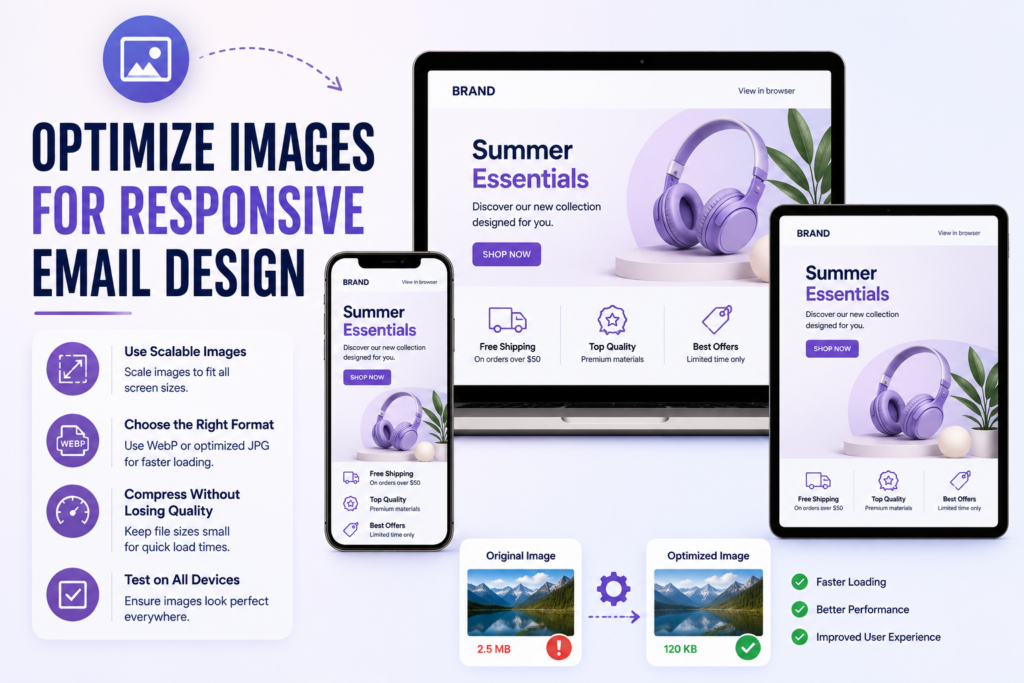
Mastering image optimization is a critical step in achieving a truly responsive email design. When images are handled correctly, they enhance your message without causing layout shifts or slow loading times. By following specific technical standards, you ensure that your visuals remain crisp and functional on every device.
Scale Images to Fit Different Screen Widths
To maintain a fluid layout, your images must scale proportionally within their containers. You should use CSS properties like max-width: 100% and height: auto to prevent images from overflowing on smaller mobile screens. This approach allows your visuals to shrink gracefully while preserving their original aspect ratio.
Use Explicit Image Dimensions and Descriptive Alt Text
Always define explicit width and height attributes in your HTML code. This practice helps email clients reserve the correct amount of space before the image finishes loading, which prevents jarring layout shifts. Furthermore, you must include descriptive alt text for every image to improve accessibility and provide context if the image fails to render.
Choose the Right File Format and Compression Settings
Selecting the correct file format is essential for balancing visual quality with performance. Use JPEG for complex photographs, while PNG or WebP formats work best for graphics with transparency or sharp lines. Always compress your files to reduce total email weight, as large images can frustrate mobile users on slower data connections.
Design Effective Image-Blocking Fallbacks
Many email clients block images by default, so your responsive email design must remain functional without them. Use background colors and styled text to ensure your layout does not collapse when images are hidden. This strategy keeps your brand identity intact even when the recipient has not enabled image viewing.
Make Image-Only Emails Understandable Without Images
Avoid sending emails that consist of a single large image. If an image fails to load, the subscriber will see nothing but a blank space, leading to poor engagement. Instead, use a mix of HTML text and images to ensure your core message and call to action remain visible at all times.
Test Retina Images Without Slowing Load Times
Retina displays require higher resolution images to look sharp, but these files can be heavy. You should test your images to find the “sweet spot” where quality remains high without exceeding reasonable file size limits. Using 2x resolution images is often sufficient for most mobile devices without sacrificing performance.
| File Format | Best Use Case | Compression Level |
|---|---|---|
| JPEG | Photographs | High |
| PNG | Logos/Icons | Medium |
| WebP | Modern Web Support | Optimized |
Choose Fonts and Text Styles That Stay Readable
Mastering typography is a critical component of responsive email design best practices. When your text is easy to read, users are more likely to engage with your message regardless of the device they use. Clear, well-structured typography ensures that your brand voice remains consistent and professional across every inbox.
Select Web-Safe Fonts With Appropriate Fallbacks
Custom fonts can add flair to your emails, but they often fail to render correctly in every email client. You should always prioritize web-safe fonts like Arial, Helvetica, or Georgia to ensure maximum compatibility. These fonts are pre-installed on most devices, providing a reliable experience for your readers.
Always define a fallback stack in your CSS to handle situations where your primary font is unavailable. A well-structured stack ensures that if your preferred font fails to load, the system defaults to a similar, readable alternative. This approach prevents your layout from breaking or appearing unprofessional.
Set Mobile-Friendly Font Sizes and Line Heights
Mobile screens require larger text to ensure readability without the need for zooming. Aim for a base font size of at least 14px to 16px for body text. This size allows users to scan your content comfortably while on the go.
In addition to size, line height is vital for maintaining a clean look. A line height of 1.4 to 1.6 times the font size prevents lines from feeling cramped. Proper spacing between lines significantly improves the overall reading experience on small screens.
Create a Clear Visual Hierarchy for Email Content
A strong visual hierarchy guides the reader’s eye through your email. Use distinct font weights and sizes to differentiate between headings, subheadings, and body text. This structure helps users quickly identify the most important information in your message.
Typography is the voice of your brand; it should be clear, consistent, and accessible to everyone who reads your message.
Use Color Contrast That Supports Accessibility
High color contrast is essential for making your text stand out against the background in responsive email design. Ensure that your text color and background color meet accessibility standards to assist users with visual impairments. Strong contrast is a cornerstone of responsive email design best practices that benefits all users.
Prevent Text Wrapping From Breaking Headings and Buttons
Long words or phrases can sometimes cause text to wrap unexpectedly, which ruins your layout. Use CSS properties like word-break or overflow-wrap to manage how text behaves within tight containers. Testing your buttons and headings on various screen widths will help you identify and fix these issues before you hit send.
Respect User Preferences for Larger Text
Many users adjust their device settings to display larger text for better accessibility. Avoid using rigid, fixed dimensions that prevent your email from scaling to these user preferences. By using relative units like percentages or ems, you allow your content to adapt gracefully to the user’s specific needs.
Apply Responsive Email Design Best Practices for Accessibility
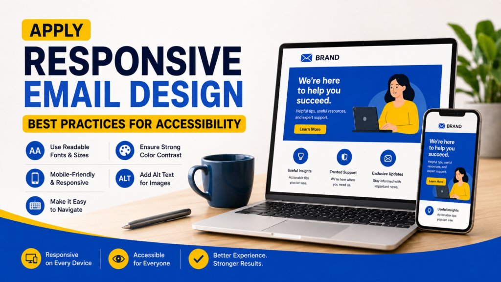
Designing for accessibility ensures that every subscriber, regardless of their physical ability, can interact with your message. By following responsive email design best practices, you create a seamless experience for users who rely on assistive technologies. This approach not only broadens your reach but also demonstrates a commitment to professional standards.
Write Content That Works With Screen Readers
Screen readers translate text into speech for users with visual impairments. To support these tools, always provide descriptive alt text for every image. Avoid using images to convey critical information, as these tools may skip them entirely.
Use Semantic Structure and Meaningful Link Text
Organize your content using a logical hierarchy of headings. This allows screen reader users to navigate your email structure efficiently. Furthermore, ensure your link text is descriptive, such as “Read our full guide” instead of a generic “Click here.”
Maintain Keyboard-Friendly Focus and Interaction States
Many users navigate emails using only a keyboard. You must ensure that all interactive elements, like links and buttons, are reachable via the tab key. Clearly visible focus states help users identify which element they are currently selecting.
Keep Important Information Out of Background Images
Some email clients block background images by default, which can hide vital text from your readers. Always place essential information in live text blocks rather than embedding it within an image. This ensures your message remains readable even if images fail to load.
Support Dark Mode Without Losing Contrast
Dark mode is increasingly popular, but it can wreak havoc on color contrast. Use high-contrast color palettes that remain legible against both light and dark backgrounds. Test your designs in both modes to ensure your text never disappears into the background.
Use Accessible Buttons Instead of Ambiguous Linked Images
Buttons should be built using HTML and CSS rather than images. This makes them easier to scale and ensures they are recognized by assistive technology. Use clear, action-oriented labels that tell the user exactly what will happen when they interact with the button.
| Feature | Best Practice | Impact |
|---|---|---|
| Alt Text | Descriptive labels | High accessibility |
| Link Text | Action-oriented | Improved navigation |
| Button Design | HTML/CSS based | Better interaction |
| Color Contrast | High ratio | Enhanced readability |
Adopting these responsive email design best practices will significantly improve your campaign performance. By prioritizing accessibility, you ensure that your brand message is clear, professional, and inclusive for every single recipient on your list.
Use Responsive Email Design Examples to Guide Your Layouts
Responsive email design examples provide a blueprint for your own marketing success. By observing how top brands structure their messages, you can learn to balance aesthetics with functionality. These examples show how different campaign goals influence your hierarchy, spacing, and call to action placement.
Promotional Email With a Hero Image and One Primary CTA
A promotional email often relies on a high-impact visual to grab attention immediately. By placing a single, bold call to action (CTA) directly below the hero image, you guide the user toward a specific conversion. This approach keeps the message focused and prevents the reader from feeling overwhelmed.
Newsletter With Stacked Editorial Content
Newsletters require a clean, vertical flow to remain readable on mobile devices. You should stack your editorial blocks so that the most important headlines appear first. This layout ensures that your subscribers can scan through your content easily without needing to zoom or scroll horizontally.
Ecommerce Email With Responsive Product Cards
Ecommerce brands often use grid layouts that collapse into a single column on smaller screens. Each product card should contain a clear image, a concise title, and a price. Maintaining consistent padding between these cards is essential for a professional look on mobile.
Event Invitation With Mobile-Friendly Details and Registration
Event invitations must prioritize clarity regarding the date, time, and location. By using a simple, centered layout, you ensure that the registration button is easy to tap. Providing all necessary details upfront helps users make quick decisions without searching through cluttered text.
What Each Example Demonstrates on Small Screens
Each of these formats demonstrates the power of a vertical, fluid flow. When you design for mobile, your content should naturally stack to fit the width of the device. This ensures that your message remains accessible regardless of the screen size.
Common Design Mistakes to Avoid in Each Format
Avoiding common pitfalls will significantly improve your engagement rates. Review the following table to identify errors that often hinder user experience:
| Format | Common Mistake | Result |
|---|---|---|
| Promotional | Oversized hero images | Slow load times |
| Ecommerce | Crowded product grids | Accidental clicks |
| Event | Multiple competing CTAs | User confusion |
Ultimately, studying these responsive email design examples will help you refine your strategy. Focus on simplicity and clarity to ensure your emails perform well on every device.
Test Emails Across Devices and Email Clients
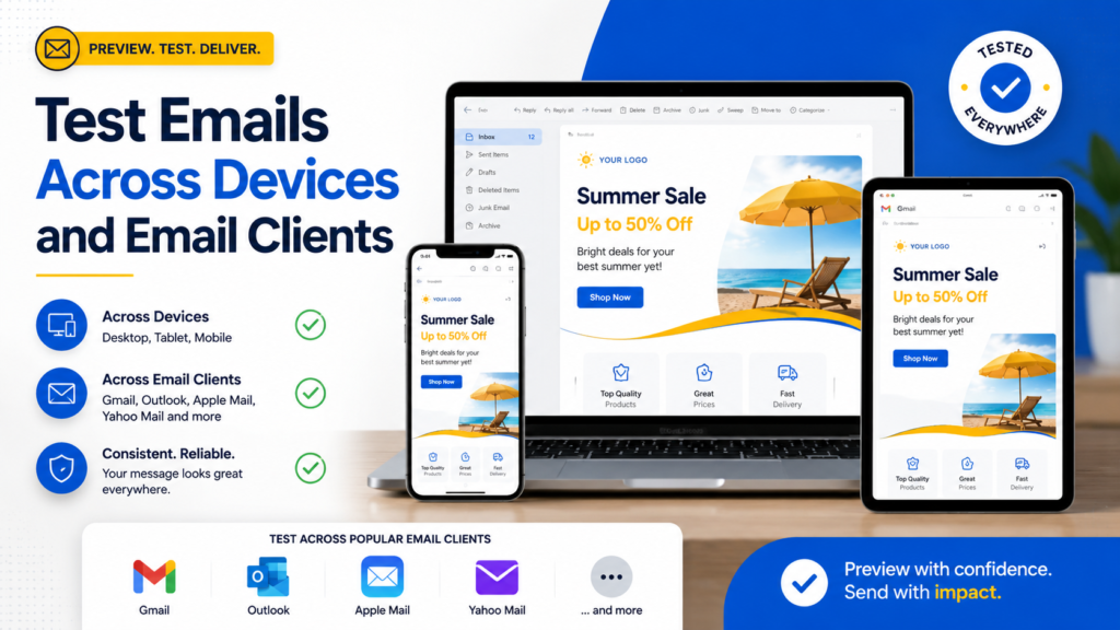
Achieving a perfect responsive email design requires a rigorous testing phase before you hit send. Because different email clients interpret code in unique ways, your layout might look flawless in one inbox but break in another. A proactive testing strategy ensures your message remains professional and functional for every subscriber.
Check Rendering in Gmail, Apple Mail, and Outlook
Major email providers often apply their own CSS overrides that can disrupt your intended layout. You must verify that your code behaves predictably across the most popular platforms. Outlook, in particular, often requires specific conditional comments to maintain structure, while Gmail may strip certain styles entirely.
Test iPhone, Android, Tablet, and Desktop Viewports
Your audience consumes content on a wide variety of hardware. You should test your templates on actual mobile devices and desktop monitors to see how the fluid containers adjust to different screen widths. This ensures that your responsive email design remains readable and easy to navigate regardless of the user’s hardware.
Review Live Links, Images, Fonts, and Interactive Elements
Beyond the layout, you must verify that every functional component works as expected. Broken links or missing images can quickly diminish your brand’s credibility. Ensure that your font fallbacks are set correctly and that all interactive buttons are large enough for touch-based navigation.
Inspect Both Light Mode and Dark Mode Rendering
Modern email clients allow users to toggle between light and dark themes, which can invert your color palette unexpectedly. You should test how your text contrast and background colors hold up in both modes. This step is vital for maintaining accessibility and visual clarity for all your readers.
| Testing Category | Primary Focus | Goal |
|---|---|---|
| Compatibility | Gmail, Outlook, Apple Mail | Consistent Rendering |
| Responsiveness | Mobile, Tablet, Desktop | Fluid Layouts |
| Functionality | Links, Buttons, Images | User Engagement |
Use Litmus or Email on Acid for Automated Preview Testing
Automated tools like Litmus or Email on Acid provide instant previews across dozens of clients. These platforms save time by highlighting potential rendering issues before you finalize your campaign. They are essential for identifying bugs that might otherwise go unnoticed during manual checks.
Perform a Manual Test Before Sending a Campaign
While automated tools are powerful, they cannot replace the experience of a real user. You should always send a test email to a variety of personal accounts on different devices. This final manual check confirms that your responsive email design feels intuitive and performs perfectly in a live environment.
Fix Common Responsive Email Design Problems
Even the most carefully crafted emails can encounter rendering issues when viewed across different devices. Following responsive email design best practices helps you identify these glitches early and maintain a professional appearance for your subscribers.
Repair Overflowing Tables and Unwanted Horizontal Scrolling
Horizontal scrolling often occurs when an element inside your email is wider than the viewport. To prevent this, always set a maximum width on your container tables and ensure that images are fluid.
Using a fixed width on inner elements can force the layout to expand beyond the screen. You should use percentage-based widths for your main containers to allow the content to shrink gracefully on smaller mobile screens.
Correct Buttons That Break or Become Difficult to Tap
Buttons often fail to render correctly if they rely on complex CSS properties that some clients ignore. You should use bulletproof button techniques, such as using padding on anchor tags or simple table-based buttons, to ensure they remain clickable.
Ensure your buttons have a minimum touch target size of 44×44 pixels. This makes it easy for users to interact with your call to action without accidentally clicking the wrong link.
Resolve Inconsistent Spacing Between Email Clients
Different email clients apply their own default margins and padding to elements like paragraphs and lists. To achieve a consistent look, you must apply a CSS reset at the top of your email code.
Explicitly setting margins and padding to zero on your primary containers prevents unexpected gaps. This is a core component of responsive email design best practices that keeps your layout tight and organized.
Handle Outlook Rendering Limitations
Microsoft Outlook often uses the Word rendering engine, which struggles with modern CSS properties like flexbox or grid. You must rely on table-based layouts to ensure your design remains stable across all versions of the application.
Replace Unsupported CSS With Safe Fallbacks
When a specific CSS property is not supported, the email client may ignore the entire block. Always provide a safe fallback, such as a standard background color or a simple font stack, to ensure the content remains readable.
| Feature | Modern Support | Outlook Fallback |
|---|---|---|
| Flexbox | High | Table Cells |
| Background Images | High | Solid Color |
| Web Fonts | Medium | System Fonts |
Use Conditional Comments Only When They Solve a Specific Issue
Conditional comments allow you to target Outlook specifically without affecting other clients. Use these sparingly to fix layout shifts or to provide specific styles that only the Windows version of Outlook requires.
Overusing these comments can lead to bloated code and maintenance headaches. Only implement them when you have documented a specific rendering failure that cannot be solved through standard, clean HTML structure.
Improve Responsive Email Templates for Performance and Conversions
You can significantly boost your conversion rates by refining how your emails render across various devices. High-performing responsive design email templates require a balance between aesthetic appeal and technical efficiency. By focusing on these core areas, you ensure that every subscriber receives a seamless experience that encourages action.
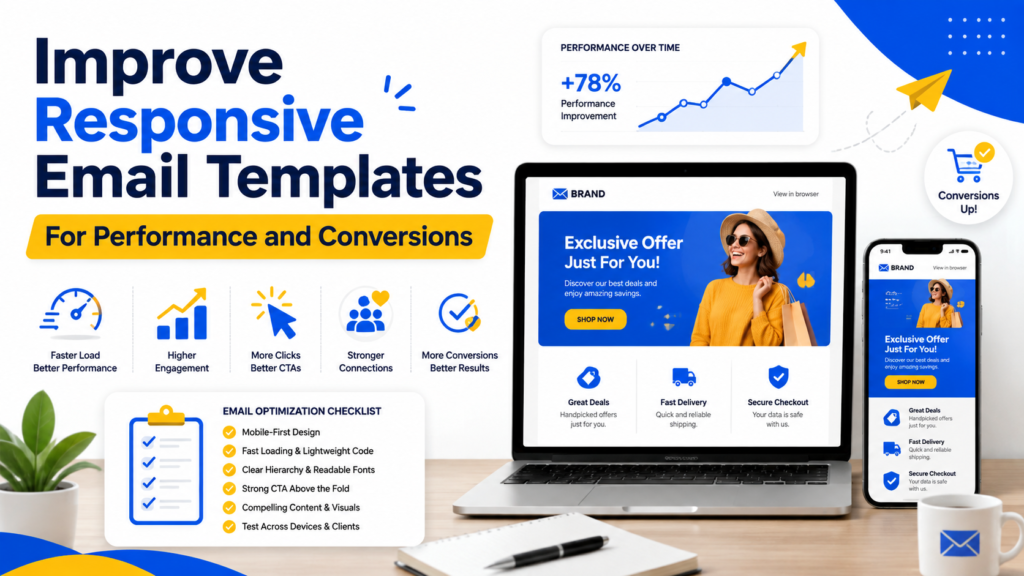
Reduce Code Bloat and Keep Email Load Times Low
Excessive HTML markup and unoptimized assets often lead to slow loading times, which can frustrate your audience. You should strip away unnecessary comments, empty tags, and redundant styles to keep your file size minimal. Compressing images before uploading them also ensures that your responsive email design remains fast and accessible on slower mobile networks.
Match the Layout to Your Audience’s Device Behavior
Understanding how your subscribers interact with your content is vital for long-term success. If your analytics show a mobile-heavy audience, you must prioritize a single-column layout that minimizes the need for horizontal scrolling. Tailoring your structure to match specific device habits ensures that your message remains clear and readable regardless of the screen size.
Make the Primary CTA Easy to Find and Complete
Your call to action (CTA) serves as the bridge between interest and conversion. On mobile devices, you should ensure that buttons are large enough to be tapped easily without accidental clicks. Placing your primary CTA in a prominent, high-visibility area helps guide the user toward the desired outcome without confusion.
Use Personalization Without Compromising Layout Stability
Personalization is a powerful tool, but it can sometimes break your layout if the dynamic content is too long or unpredictable. You should use fixed-width containers or flexible padding to ensure that personalized text does not push other elements out of alignment. Maintaining a stable structure allows your brand to deliver relevant messages while preserving the integrity of your design.
Review Engagement Data by Device and Email Client
Data provides the roadmap for your future design decisions. You should regularly analyze engagement metrics, such as click-through rates, segmented by specific devices and email clients. This insight helps you identify which platforms might require additional testing or layout adjustments to improve overall performance.
Iterate on Layouts Through A/B Testing
Assumptions can lead to missed opportunities, so you should rely on A/B testing to validate your design choices. By testing variations of your layout, you can determine which elements drive the highest conversions for your specific audience. This iterative process ensures that your email strategy evolves based on measurable results rather than guesswork.
| Optimization Strategy | Primary Benefit | Impact Level |
|---|---|---|
| Code Minification | Faster Load Times | High |
| Touch-Friendly CTAs | Higher Click Rates | Critical |
| Device-Specific Testing | Improved Rendering | High |
| A/B Layout Testing | Data-Driven Growth | Critical |
Upgrade Your Email Strategy Today
Give your campaigns a stronger foundation with responsive design, accessible layouts, and conversion-focused CTAs. Choose a plan that fits your needs and start building emails.
Conclusion
Creating a high-performing email requires a blend of mobile-first planning, flexible HTML, and scalable imagery. Your success depends on how well you integrate readable typography with accessible design principles. A robust responsive email design ensures your message reaches every subscriber regardless of their device.
Email clients often interpret code in unique ways. You must rely on smart fallbacks to maintain a consistent look across platforms like Gmail or Outlook. These safety nets protect your brand identity when standard web features fail to render as expected.
Track your metrics to see how different devices impact your engagement rates. Use this data to refine your templates and improve your conversion goals. A commitment to responsive email design keeps your campaigns attractive and functional for every reader on your list.
FAQs
What is responsive email design and why is it essential for modern marketing?
What is responsive email design? It is a development approach where an email’s layout, images, and text automatically adapt to the screen size of the device being used, whether it is an iPhone, a Samsung Galaxy tablet, or a desktop running Microsoft Outlook. It is essential because a significant portion of recipients open messages on mobile devices; if your responsive email layout is difficult to read or requires horizontal scrolling, your engagement rates will drop.
How to design a responsive email that functions well across all clients?
To understand how to design a responsive email, you must prioritize a mobile-first email design strategy. This involves using fluid widths, inline CSS, and media queries to stack columns vertically on small screens. Brands like Nike and Apple often utilize a single-column responsive email layout for their promotional messages to ensure the primary call to action remains the focal point without cluttering the mobile viewport.
Why should I use responsive design email templates instead of fixed-width layouts?
Fixed-width layouts are designed for a specific pixel width, which often results in a “zoomed-out” or “cut-off” appearance on smartphones. In contrast, responsive design email templates use percentage-based containers that allow content to shrink or expand. By adopting these templates, you provide a seamless experience for Gmail and Apple Mail users, preventing the frustration of pinching and zooming to read small text.
What are the most important responsive email design best practices for accessibility?
Key responsive email design best practices include using a legible font size (at least 14–16px for body text), maintaining high color contrast, and providing descriptive alt text for images. You should also ensure that your buttons have large enough touch targets, at least 44×44 pixels, so that users on mobile devices can easily interact with your links. Furthermore, always use semantic HTML to support screen readers for visually impaired subscribers.
Where can I find effective responsive email design examples for inspiration?
You can find high-quality responsive email design examples on platforms like Really Good Emails, which showcases how brands like Patagonia or Airbnb handle complex layouts. These examples demonstrate how multi-column product grids on a desktop can gracefully transition into a stacked vertical list on a mobile device, maintaining a logical reading hierarchy and clear visual flow.
How do I troubleshoot rendering issues in different versions of Outlook?
Microsoft Outlook is notorious for its limited support of modern CSS. To fix common problems, you should use table-based layouts for the structural skeleton and apply conditional comments to target specific Outlook versions. If your responsive design email templates are breaking, ensure you have set explicit widths for table cells and avoided using “float” or “margin” properties that Outlook often ignores.
Which tools are recommended for testing a responsive email layout?
Before sending a campaign, it is vital to test your responsive email layout using professional preview tools like Litmus or Email on Acid. These platforms allow you to see exactly how your email renders across dozens of different devices and clients simultaneously. Additionally, you should always perform a manual test by sending the email to your own Android and iOS devices to verify that the buttons are easy to tap and the images load quickly.
How can I optimize images within my responsive email design?
To ensure images look sharp without slowing down load times, use Retina-ready assets (saving them at twice the intended display size) but compress them using tools like TinyPNG. In your CSS, set images to `max-width: 100%` and `height: auto` so they scale proportionally within their containers. This prevents images from “breaking” the layout on narrow screens while maintaining high visual quality on desktop displays.