
As I reflect on my own experiences with email marketing, I’m reminded of the significant impact that colors can have on brand awareness and recognition. Did you know that colors can increase brand awareness by 80%? This statistic highlights the importance of selecting the right hues for your email campaigns. Colors are more than just visual elements—they communicate mood, meaning, and intent. When used consistently, they become a powerful tool for brand recall and emotional connection. Choosing the right color scheme can instantly elevate the professionalism and clarity of your message.
In my opinion, the strategic use of email colors can make or break an email marketing campaign. By choosing the right palette, businesses can evoke emotions, convey their brand identity, and drive consumer behavior. Color isn’t just about aesthetics—it guides the viewer’s eye and influences decision-making. The right shade in the right place can increase click-through rates and conversions significantly. Consistent color usage also builds trust and creates a memorable brand experience across all touchpoints.
Key Takeaways
- Colors play a crucial role in email branding and recognition.
- The right email colors can evoke emotions and drive consumer behavior.
- Email color psychology is essential for effective email marketing.
- A well-chosen color palette can significantly impact brand awareness.
- Color psychology in email campaigns can influence consumer decision-making.
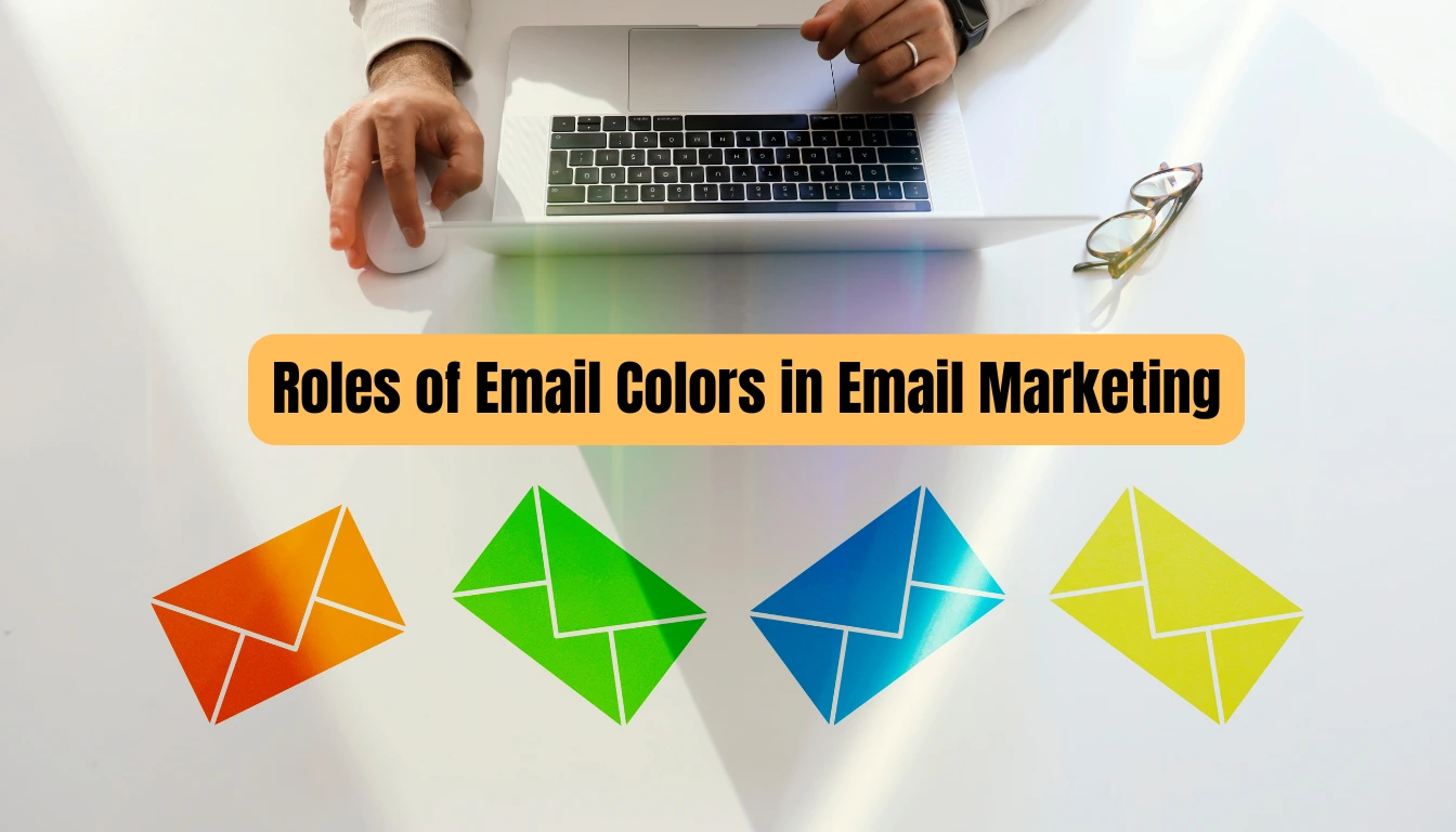
Email Color Strategy That Works: Boost Engagement with Design Techniques
Discover how to use the psychology of email color to increase clicks, build brand consistency, and drive results. With MailerRocket’s powerful custom editor and testing tools, designing high-converting emails is easier than ever.
The Psychology Behind Color in Digital Communication
In digital communication, the strategic use of color can significantly enhance the effectiveness of email marketing. Colors are not just aesthetically pleasing; they play a crucial role in influencing consumer behavior and decision-making processes.
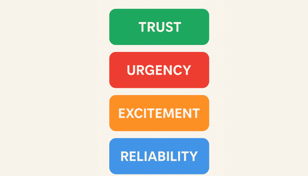
Different colors evoke specific feelings and associations. For instance, warm colors like red, orange, and yellow can create a sense of urgency or excitement, while cool colors like blue, green, and purple can evoke a sense of calm and trust. Understanding these color associations is essential for creating effective email marketing campaigns that resonate with the target audience.
How Color Perception Influences Consumer Decision-Making
Color perception significantly influences consumer decision-making. When consumers are exposed to certain colors, it can trigger emotional responses that affect their purchasing decisions. For example, the color red is often associated with sales and promotions, encouraging impulse buys. On the other hand, blue is typically associated with trust and reliability, making it a popular choice for financial institutions.
The Science of Color-Triggered Emotional Responses
The science behind color-triggered emotional responses is rooted in psychology and neuroscience. Research has shown that different wavelengths of light (which we perceive as different colors) can affect the brain’s emotional centers, influencing mood and behavior. By leveraging this knowledge, marketers can use color strategically in their email campaigns to elicit desired emotional responses from their audience.
For instance, using a color scheme that aligns with the brand’s identity and message can enhance brand recognition and create a cohesive visual experience. This not only improves the aesthetic appeal of the email but also contributes to a more effective marketing strategy by influencing consumer emotions and actions.
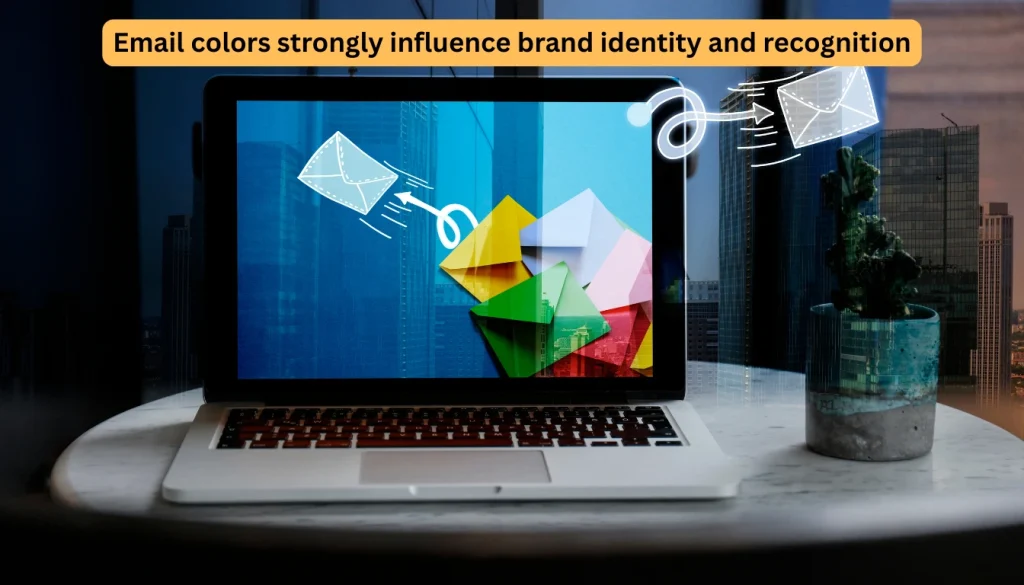
Role #1: Email Colors Establish Brand Identity and Recognition
The impact of email colors on brand identity and recognition cannot be overstated in the digital age. Colors can increase brand recognition by up to 80%, making them a crucial element in email marketing strategies.
A consistent color palette helps establish familiarity and trust with your audience over time.
When recipients instantly associate a color scheme with your brand, it strengthens your visual presence.
This kind of recognition can significantly improve engagement and customer loyalty in crowded inboxes.
Creating Visual Consistency Across Marketing Channels
Visual consistency is key to reinforcing brand identity across various marketing channels, including email campaigns. By using a consistent color palette, brands can create a cohesive visual identity that resonates with their audience. This consistency helps in building trust and making the brand more recognizable. It ensures that no matter where a customer interacts with the brand—website, social media, or email—they receive a unified visual message. Over time, this strengthens brand recall and fosters customer loyalty.
Case Examples: How Major Brands Leverage Color Psychology
Iconic brands like Coca-Cola, Nike, PayPal, and McDonald’s are exemplary models of effective color usage in branding. Let’s examine how these brands utilize color psychology in their email marketing campaigns. Each of these brands uses color intentionally to evoke emotions that align with their core messaging. Their success illustrates how strategic color choices can deepen customer connection and influence behavior across digital channels.
Email Color Branding Strategies of Iconic Brands
| Brand | Primary Color | Color Purpose in Emails | Psychological Effect |
|---|---|---|---|
| Nike | Black/White | Minimalist, bold accent for buttons/headlines | Strength, sophistication |
| Coca-Cola | Red | Urgency, excitement, strong brand recall | Energy, passion, alertness |
| PayPal | Blue | Clean backgrounds, trust-building | Security, trust, professionalism |
| McDonald’s | Red/Yellow | Highlight deals and fast service | Hunger, urgency, energy |
Nike’s Minimalist Approach to Color
Nike is known for its sleek, minimalist design philosophy, often leveraging a bold yet simple color scheme that aligns seamlessly with its brand identity. Predominantly using black and white with strategic pops of accent colors, Nike creates a clean, powerful visual aesthetic that emphasizes performance and modernity. This intentional use of minimalism in color not only ensures clarity in messaging but also reinforces a strong and consistent visual association with the brand across all marketing channels, including email campaigns.
Coca-Cola’s Iconic Red in Email Campaigns
Coca-Cola’s use of red in its branding is iconic and instantly recognizable. In their email campaigns, this bold red evokes urgency and excitement, driving engagement and conversions. It also reinforces brand identity and draws immediate attention to key promotional elements.
PayPal’s Trust-Building Blue in Email Design
PayPal consistently uses shades of blue across its branding and email campaigns, reinforcing its identity as a secure and trustworthy financial service. This color choice is strategic — blue evokes a sense of reliability and professionalism, which is essential for building user confidence in transactions and account activity. In email marketing, PayPal leverages this blue palette to maintain consistency, reduce friction, and foster trust with its users.
McDonald’s Bold Red and Yellow for Instant Recognition
McDonald’s iconic red and yellow color scheme is a masterclass in fast-food branding, and their email marketing reflects the same energy. Red stimulates appetite and urgency, while yellow adds warmth and cheerfulness. In email campaigns, this bold combination is used to promote limited-time offers and meal deals, grabbing attention immediately and triggering fast responses from customers.
Role #2: Email Colors Drive Engagement and Boost Click-Through Rates
Colors in email marketing are not just aesthetically pleasing; they are a powerful tool for boosting engagement. The right color palette can draw attention, evoke emotions, and drive actions. In this section, we’ll explore how to harness the power of email colors to enhance click-through rates and overall campaign performance.
High-Converting Button and CTA Color Combinations
The color of a call-to-action (CTA) button can significantly influence click-through rates. Different colors evoke different emotional responses, making some more suitable for CTAs than others. A well-chosen CTA color can draw the viewer’s eye and prompt immediate action. It’s essential to test and match CTA colors with the overall email design for maximum impact. Even subtle shifts in hue or contrast can lead to measurable differences in user engagement, making color selection a critical component of effective email marketing.
The Psychology Behind Green vs. Red vs. Orange vs. Blue CTAs
Emotional Triggers of Common CTA Colors
| CTA Color | Emotional Response | Best Use Case |
|---|---|---|
| Green | Trust, calm, confirmation | Subscriptions, signups, checkout |
| Red | Urgency, | Flash sales, limited-time offers |
| Orange | Friendly, inviting, excitement | Trial offers, soft promotions |
| Blue | Reliability, stability | Account creation, B2B communication |
Green is often associated with trust and harmony, making it an excellent choice for CTAs that require a sense of reliability. Red, on the other hand, creates a sense of urgency and is typically used for limited-time offers. Orange strikes a balance between the two, conveying excitement without being overly aggressive. Blue is commonly linked to professionalism, security, and stability, making it ideal for CTAs in financial services, SaaS platforms, or any brand that wants to build trust and credibility.
A/B Testing Results for Different Color Schemes
A/B testing different CTA colors can reveal surprising insights into recipient behavior. For instance, a study might show that a green CTA outperforms a red one, contrary to the common assumption that red always drives more clicks. Testing allows marketers to move beyond guesswork and rely on real data. Over time, these insights can lead to better design decisions and higher conversion rates.
Strategic Color Contrast Techniques That Capture Attention
To make your CTAs stand out, it’s crucial to use strategic color contrast. This involves selecting colors that not only appeal to your target audience but also differentiate your CTAs from the surrounding content. By doing so, you can significantly increase the likelihood of clicks.
For example, if your email background is light, using a bold, contrasting color for your CTA can make it more visible. Conversely, if your background is dark, a lighter CTA color can achieve the same effect. The goal is to ensure the CTA stands out without clashing with the overall design. Proper contrast not only improves visibility but also enhances the user experience and encourages more clicks.
Role #3: Email Colors Enhance Readability and User Experience
Effective email colors can elevate the overall user experience by enhancing readability and visual appeal. When designing emails, it’s crucial to consider how colors impact the recipient’s ability to read and engage with the content. Poor color choices can lead to eye strain or confusion, reducing the effectiveness of your message. Thoughtful color selection ensures your content is both accessible and aesthetically pleasing.
Balancing Text and Background Colors for Maximum Legibility
Balancing text and background colors is crucial for maximum legibility. A high contrast between text and background colors ensures that the content is easily readable on various devices and screen types. For instance, using a dark background with light text or vice versa can significantly improve readability. It’s also essential to avoid using color combinations that might cause eye strain, such as bright blue text on a red background.
Color Accessibility Considerations for Inclusive Email Design
Color accessibility considerations are essential for inclusive email design. Ensuring that your emails are accessible to everyone, including those with visual impairments, is not only a best practice but also a necessity. This involves considering color blindness and other visual conditions when selecting color schemes. Using patterns, labels, or icons alongside color can help convey meaning without relying solely on hue. Inclusive color choices improve user engagement and show respect for diverse audiences.
Meeting WCAG Standards in Email Marketing
To make your emails more accessible, it’s vital to meet the Web Content Accessibility Guidelines (WCAG) standards. WCAG recommends a contrast ratio of at least 4.5:1 for normal text and 3:1 for large text. By adhering to these guidelines, you can ensure that your emails are readable for a wider audience. Accessibility not only improves user experience but also helps avoid legal risks. Prioritizing inclusive design demonstrates your brand’s commitment to all users.
Tools for Testing Color Contrast Ratios
Several tools are available to test color contrast ratios and ensure that your email design meets accessibility standards. Tools like WebAIM’s Color Contrast Checker and Contrast Checker by Snook can help you evaluate your color choices and make necessary adjustments. By using these tools, you can create more inclusive and readable email campaigns.
Color choices aren’t just design decisions — they’re conversion tools. Learn how to apply the right email color psychology to trigger action and improve engagement.
Role #4: Email Colors Segment and Target Specific Audiences
When it comes to email marketing, understanding the impact of color on different demographics is crucial for effective segmentation and targeting. By leveraging demographic-specific color preferences, businesses can create targeted email campaigns that resonate with their audience. This approach allows marketers to tailor messages that feel more personal and culturally relevant. As a result, color-driven segmentation can lead to higher open rates, engagement, and conversions.
Demographic-Specific Color Preferences and Patterns
Different demographics have unique color preferences that can be leveraged in email marketing. Understanding these preferences is key to creating effective email segmentation strategies. Factors such as age, gender, cultural background, and even geographic location can influence how colors are perceived. Marketers who adapt their color choices to fit these preferences stand a better chance of capturing attention and building brand loyalty.
Age Group Color Preferences
Research has shown that different age groups respond to different colors. For instance, younger audiences tend to respond well to bright and bold colors, while older demographics prefer more muted tones. Here are some key age-related color preferences:
- 18-24-year-olds: Bright colors like orange and green
- 25-44-year-olds: Vibrant colors like blue and purple
- 45-64-year-olds: More subdued colors like beige and gray
- 65 and above: Softer colors like pastel shades
| Age Group | Preferred Colors | Color Psychology Insight |
|---|---|---|
| 18–24 years | Bright orange, green | Energetic, youthful, bold |
| 25–44 years | Blue, purple | Confident, modern, slightly luxurious |
| 45–64 years | Beige, navy, subtle shades | Classic, professional, less aggressive |
| 65+ years | Soft pastels, light blues, gray | Comforting, easy on the eyes, friendly |
Gender-Based Color Response Differences
Gender also plays a role in color preferences. While individual preferences may vary, there are some general trends:
- Women tend to prefer softer, more muted colors like pink and lavender
- Men often respond better to bolder, more vibrant colors like blue and red
Industry-Specific Color Strategies That Convert
Different industries also have unique color preferences that can be leveraged in email marketing. For example, the healthcare industry often uses calming colors like blue and green, while the fashion industry uses bold and vibrant colors to grab attention. Tech companies may favor clean whites and blues to convey innovation and trust. Meanwhile, food and beverage brands often use warm tones like red and yellow to stimulate appetite and excitement.
By understanding these industry-specific color preferences, businesses can create targeted email campaigns that drive engagement and conversion. Aligning your email color scheme with your industry norms helps build credibility and audience trust. At the same time, small deviations from typical colors can help your brand stand out—when done strategically. Balancing conformity with creativity is key to maximizing visual impact.
Role #5: Email Colors Convey Message Tone and Create Urgency
Email colors play a crucial role in conveying the tone of a message and creating a sense of urgency. The strategic use of colors in email marketing campaigns can significantly impact how recipients perceive and respond to the message. Colors like red or orange can signal limited-time offers or important updates, prompting quicker action. Meanwhile, softer tones can convey calm, friendliness, or professionalism depending on the context.
Using Strategic Colors to Signal Promotions and Limited-Time Offers
Colors like red, orange, and yellow are often associated with promotions, discounts, and limited-time offers. Using these colors strategically can draw attention to calls-to-action (CTAs) and encourage recipients to take action quickly. For instance, a flash sale email campaign might use a bold red background to signal urgency. These attention-grabbing colors can create visual urgency even before a reader sees the text. When used sparingly and purposefully, they can significantly boost conversion rates.
Seasonal Color Strategies for Holiday and Event Marketing
Seasonal color strategies can enhance the relevance and appeal of email marketing campaigns during holidays and special events. By incorporating colors associated with specific holidays, brands can create a more engaging and festive experience for their audience. These color cues help set the tone and emotionally connect with seasonal moods. They also tap into consumer expectations, making campaigns feel timely and relevant.
Holiday-Specific Color Schemes That Drive Sales
For example, using red and green during Christmas or pastels during Easter can evoke a sense of festivity and increase the likelihood of conversion. These color schemes can be applied to various elements of the email, including backgrounds, text, and CTAs. Consistency with holiday aesthetics helps grab attention and builds immediate context. When aligned with compelling offers, these colors make the messaging more impactful.
Adapting Colors for Different Seasonal Campaigns
It’s essential to adapt color strategies for different seasonal campaigns. For instance, using cooler colors like blues and purples during summer sales or warm colors like oranges and yellows during autumn promotions can help align the email campaign with the current season. These shifts in color palettes reflect changing consumer moods and environmental cues. A well-timed color update can refresh your brand’s presence and maintain audience interest.
How to Develop a Strategic Email Colors Palette for Your Brand
Establishing a consistent email color palette is essential for reinforcing your brand’s image and messaging. A well-designed color scheme can elevate your brand’s visual identity, making your emails more recognizable and engaging.
Tools and Resources for Creating Harmonious Email Color Schemes
To develop an effective email color palette, you can leverage various tools and resources. Some popular options include:
- Color palette generators like Adobe Color and Coolors
- Design systems and style guides that provide pre-defined color schemes
- Online color picker tools that allow you to extract colors from images or websites
These tools can help you create a harmonious color scheme that aligns with your brand’s overall visual identity.
Implementing and Testing Your Email Color Strategy
Once you have developed your email color palette, it’s crucial to implement and test it across various email campaigns. This involves:
- Applying your color scheme consistently across different email templates
- Conducting A/B testing to determine the most effective color combinations
- Monitoring and analyzing the impact of your color strategy on engagement metrics
Split Testing Methodologies for Color Optimization
Split testing, or A/B testing, is a valuable methodology for optimizing your email color strategy. By testing different color variations, you can identify which ones resonate best with your audience. This data-driven approach removes guesswork and ensures your design choices are backed by real performance metrics. Over time, consistent testing can lead to higher engagement, improved click-through rates, and better ROI.
Measuring Color Impact on Conversion Metrics
To measure the effectiveness of your email color strategy, you need to track key conversion metrics such as click-through rates, open rates, and conversion rates. Analyzing these metrics will help you refine your color palette and improve overall campaign performance.
| Color Scheme | Click-Through Rate (CTR) | Conversion Rate |
|---|---|---|
| Scheme 1 | 2.5% | 1.2% |
| Scheme 2 | 3.1% | 1.5% |
| Scheme 3 | 2.8% | 1.3% |
Common Email Color Mistakes That Hurt Your Marketing Results
Email color mistakes can significantly impact your marketing results, often in subtle but crucial ways. As we dive into the world of email marketing, it becomes clear that the strategic use of colors is not just about aesthetics; it’s about creating an effective communication channel that resonates with your audience.
Let’s explore some common pitfalls that marketers encounter when it comes to email colors.
Oversaturation and Visual Fatigue: Finding the Right Balance
Oversaturation occurs when too many colors are used in an email, leading to visual fatigue. This can cause recipients to feel overwhelmed, resulting in decreased engagement. To avoid this, limit your color palette to 2-3 core colors that align with your brand identity. For instance, a well-known brand like Coca-Cola effectively uses a consistent red color across their marketing campaigns, including emails.
Inconsistency Across Email Campaigns and Touchpoints
Inconsistency in email colors can dilute your brand’s message and confuse your audience. To maintain color consistency, establish a clear brand guideline that outlines the specific colors to be used across all email campaigns and touchpoints. For example, Mailchimp uses a consistent color scheme across their emails and website, reinforcing their brand identity.
Ignoring Cultural and Contextual Color Associations
Colors can have different meanings in various cultures and contexts. Ignoring these cultural nuances can lead to misinterpretation of your message. For instance, while white is often associated with purity in Western cultures, it’s associated with mourning in many Asian cultures. Be mindful of these differences when designing your email campaigns, especially if you’re targeting a global audience. As
“The right color can make your message more relatable and engaging, but the wrong one can alienate your audience.”
By being aware of these common email color mistakes, you can refine your email marketing strategy to better engage your audience and drive more effective results.
Real-World Success Stories: Email Color Transformations
Real-world examples demonstrate how optimizing email colors can lead to substantial gains in marketing performance. By transforming their email marketing strategies through color optimization, numerous brands have achieved remarkable results. These improvements often include higher open rates, increased click-throughs, and stronger customer loyalty. It highlights the powerful role that visual design plays in overall email campaign success.
Retail Brand Case Study: Before and After Color Optimization
A prominent retail brand revamped its email marketing strategy by optimizing its color scheme. The before and after comparison revealed a significant increase in click-through rates and a notable improvement in customer engagement.
The brand changed its primary button color from a muted gray to a vibrant orange, resulting in a 25% increase in conversions. This change not only enhanced the visual appeal but also drew attention to the call-to-action (CTA) buttons.
Service Industry Email Redesign Results
Service industry brands have also benefited from email color transformations. By redesigning their email templates with optimized color schemes, these brands have seen improvements in their marketing metrics. Enhanced color contrast and brand-consistent palettes have led to better readability and engagement. These visual upgrades have also contributed to increased trust and professionalism in customer communication.
Financial Services Color Strategy Shift
A financial services company shifted its email color strategy from a predominantly blue palette to a more diverse scheme incorporating shades of green and orange. This change resulted in a 15% increase in open rates and a 10% boost in engagement. The updated palette conveyed both trust and optimism, appealing to a broader audience. This subtle visual refresh helped the brand stand out in crowded inboxes while maintaining a professional tone.
Healthcare Provider’s Email Color Rebrand
A healthcare provider rebranded its email marketing by introducing a soothing color palette that featured calming blues and whites. The new design led to a 20% reduction in unsubscribe rates and a more positive patient response. The shift also improved readability and reflected the organization’s commitment to comfort and care. Patients reported feeling more at ease and more willing to engage with the content.
These real-world success stories underscore the importance of email color transformations in achieving marketing goals. By optimizing their email colors, brands across various industries have enhanced their marketing performance and improved customer engagement. Color adjustments, even subtle ones, can significantly influence user behavior and perception. This proves that thoughtful visual design is just as critical as the message itself.
Email Color Optimization: A Marketer’s Guide to Better Performance
Colors influence clicks, trust, and user behavior. Explore strategies for optimizing email color and take full control with MailerRocket’s advanced features.
Conclusion
Email colors play a crucial role in effective email marketing, influencing how recipients perceive and interact with your campaigns. By understanding color psychology and using colors strategically, you can significantly impact your marketing results.
Throughout this article, we’ve explored the five essential roles of email colors: establishing brand identity, driving engagement, enhancing readability, segmenting audiences, and conveying message tone. By leveraging these roles, you can create email campaigns that resonate with your target audience and drive conversions.
When developing your email color strategy, consider the tools and resources available to create harmonious color schemes. Testing and refining your approach will help you optimize your email design and improve overall performance.
By applying the principles of color psychology and email design, you can elevate your email marketing efforts and achieve greater success. I will continue to refine my email color strategy to maximize its potential and drive meaningful results.
You can have an opportunity to receive extra $37k + Bonuses if you finish 2 steps below:
- Step 1- Get MailerRocket by Clicking Here
- Step 2- You will get ALL my Exclusive Cloud-Based Software Bonuses listed below!
These bonuses are hand-picked to supercharge your MailerRocket experience — including tools for lead generation, traffic, analytics, and conversion! IMPORTANT: After completing your order, don’t forget to email me at admin@mailerrocket.com with your purchase receipt or confirmation screenshot.
Bonus 1 – 500 Digital Product Business Ideas
Unlock a treasure trove of 500 profitable digital product ideas for any niche.
From eBooks to online courses, printables to templates — endless inspiration awaits.
Perfect for creators, freelancers, marketers, and aspiring solopreneurs.
Ideas categorized by skill level, industry, and target audience.
Includes trends for 2025 and beyond — stay ahead of the curve.
Each idea is designed for low-cost, high-margin digital delivery.
Discover ideas that scale, automate, and generate passive income.
Includes bonus tips for pricing, platforms, and marketing.
Ideal for Etsy, Gumroad, Shopify, ClickBank, and more.
Save time on brainstorming — launch faster with clarity.
Whether you want side income or a full-time digital empire — this is your guide.
Turn your creativity into cash with these powerful product ideas!
Bonus 2 – The Sales Lead System Guide
Unlock the full potential of your business with this exclusive Sales Lead System Guide.
Learn proven techniques to attract, nurture, and convert high-quality leads effectively.
Discover step-by-step strategies for building powerful lead funnels that actually work.
Master lead scoring, segmentation, and automation to save time and boost conversions.
Get insights into top-performing tools, scripts, and templates used by sales pros.
Ideal for marketers, entrepreneurs, and sales teams looking to scale fast.
Includes bonus checklists and lead magnet ideas to supercharge your outreach.
Turn cold prospects into loyal customers with this easy-to-follow lead generation blueprint.

Bonus 3 – 1 Million Youtube Subscribers Free
1 Million YouTube Subscribers Free – sounds like a dream come true for any aspiring content creator, right? This bonus is designed to unlock the secrets behind explosive YouTube growth without paying for ads or using shady bots. Whether you’re starting a channel or struggling to gain momentum, this bonus guide reveals proven strategies used by top influencers to organically build a massive audience. From mastering the YouTube algorithm to crafting irresistible thumbnails and titles that drive clicks, it covers every step needed to attract real, engaged subscribers who stick around.
Inside this bonus, you’ll also discover how to turn viewers into loyal fans using powerful storytelling techniques and content hooks that keep people watching and sharing. Learn how to leverage trending topics, use data analytics to optimize your content calendar, and tap into community engagement features to boost visibility. With practical tips, templates, and step-by-step walkthroughs, “1 Million YouTube Subscribers Free” is more than a title — it’s a complete growth engine for your channel success.

Bonus 4 – Mastering Sales Funnel PLR
Mastering Sales Funnel PLR is a powerful private label rights (PLR) package designed to help marketers, coaches, and entrepreneurs build and optimize high-converting sales funnels without starting from scratch. This bundle typically includes in-depth training content, step-by-step guides, email swipes, sales page templates, and lead magnets — all fully editable and brandable. Whether you’re looking to educate your audience, generate leads, or sell a digital product, this PLR gives you a professional edge by saving hours of research, writing, and design. You can rebrand the content as your own, resell it, or use it as part of a broader value ladder strategy.
What makes this PLR package stand out is its focus on real-world funnel strategies that convert. From crafting irresistible lead magnets to designing compelling upsell pages and backend offers, Mastering Sales Funnel PLR walks users through each phase of the customer journey. It’s ideal for affiliate marketers, product creators, and service providers who want to understand buyer psychology and implement proven funnel tactics without hiring expensive consultants or copywriters. With high-quality, done-for-you content, this PLR pack can help boost authority, drive engagement, and increase revenue — all while giving you the freedom to customize the material to match your brand voice.

Bonus 5 – Make Money with AI ART PLRs
Make Money with AI ART PLRs is an exciting opportunity for digital entrepreneurs looking to capitalize on the booming AI and art markets. AI-generated art has taken the internet by storm, with platforms like Midjourney, DALL·E, and others enabling anyone to create stunning visuals in seconds. With Private Label Rights (PLR), you get ready-made AI art packages that you can rebrand, resell, or use in your own products—without needing to create the artwork yourself. This dramatically lowers the barrier to entry, making it ideal for beginners and pros alike. You can monetize these assets by selling digital prints, using them in social media bundles, or even incorporating them into online courses or content packs.
The beauty of AI ART PLRs lies in their versatility and scalability. You can bundle collections as niche-specific art packs—like abstract wall art, motivational posters, or book covers—and sell them on platforms like Etsy, Gumroad, or your own Shopify store. You can also license them for commercial use or turn them into NFTs. Since the content is PLR, you save time on production and focus more on marketing and branding. Whether you’re a blogger, affiliate marketer, coach, or creative entrepreneur, AI ART PLRs offer a passive income stream that grows as you scale your traffic and reach.

Bonus 6 – 2499+ ChatGPT Prompts Bonus
Unlock the full potential of ChatGPT with this incredible 2499+ Prompts Bonus Pack—your ultimate toolkit for creativity, productivity, and success. Whether you’re a marketer, content creator, student, coach, entrepreneur, or AI enthusiast, this bonus offers a vast collection of expertly crafted prompts to supercharge your results. From blog ideas, email sequences, product descriptions, SEO strategies, and social media posts to business planning, sales scripts, customer support, coding tasks, and beyond—these prompts cover every possible use case, saving you hours of work and delivering instant inspiration at your fingertips.
Each prompt is designed to get high-quality responses with minimal tweaking, helping you work smarter and faster. With neatly organized categories, you can quickly find what you need for your niche or profession. This bonus pack is perfect for anyone looking to automate repetitive tasks, generate high-converting content, brainstorm new ideas, or simply explore the full range of ChatGPT’s capabilities. Whether you’re a beginner or an expert, the 2499+ ChatGPT Prompts Bonus is your gateway to becoming a power user—turning AI into your personal assistant, strategist, and creative partner.

Bonus 7 – 500+ Hot Selling Patterns
500+ Hot Selling Patterns is more than just a bonus—it’s a comprehensive vault of winning blueprints that have already proven successful across various niches. Whether you’re a digital marketer, content creator, product seller, or coach, these patterns offer plug-and-play formats for emails, social media posts, sales funnels, and ad creatives. Each pattern is backed by real-world performance data, giving you a shortcut to boost engagement, drive conversions, and create content that connects instantly with your audience. Instead of reinventing the wheel, you’ll be equipped with a library of proven scripts and layouts that save time and maximize results.
This bonus is especially powerful for beginners and busy entrepreneurs who want fast, reliable inspiration without second-guessing what works. From emotional storytelling frameworks and curiosity-driven subject lines to scarcity-infused call-to-actions and high-retention video hooks, you’ll find ready-to-use templates for every stage of your customer journey. With over 500 patterns at your fingertips, scaling your marketing campaigns becomes effortless—and far more effective. Whether you’re launching a new offer or optimizing an existing one, these high-converting patterns will give you a competitive edge in today’s fast-paced digital marketplace.